Portfolio
What We've Done
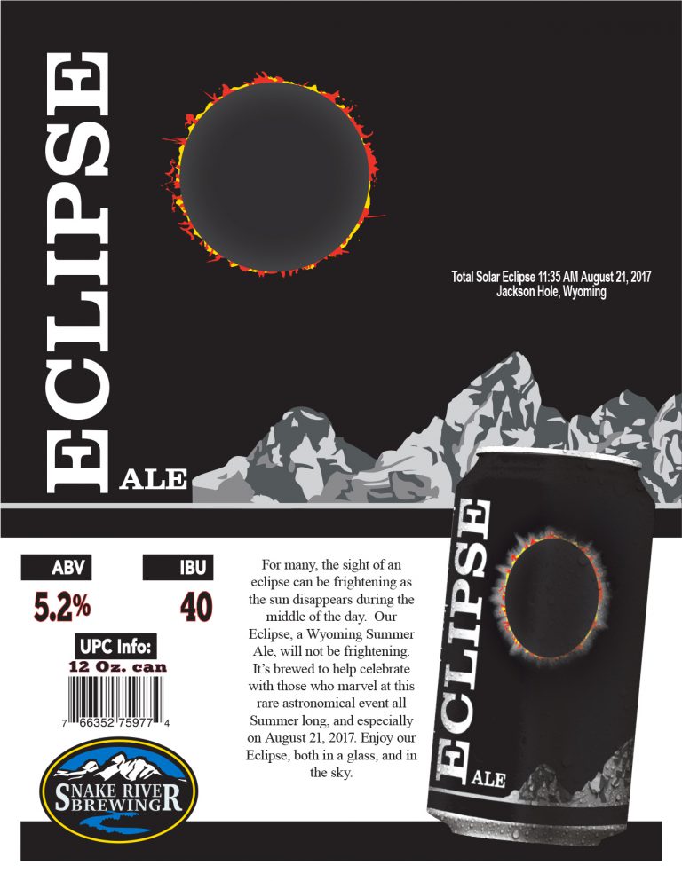
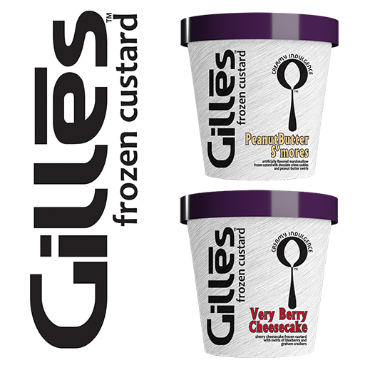
In our more than 20 years of business we have designed multitudes of projects. We’ve helped companies create their identity with new logos, and helped existing companies enhance their branding. Dozens and dozens of package designs for companies from Alaska to Connecticut and in between. Company brochures, websites, electronic presentations, trade show materials, signage items, truck decal design…..the list goes on. The following are a few of the most recent projects we’d like to share:
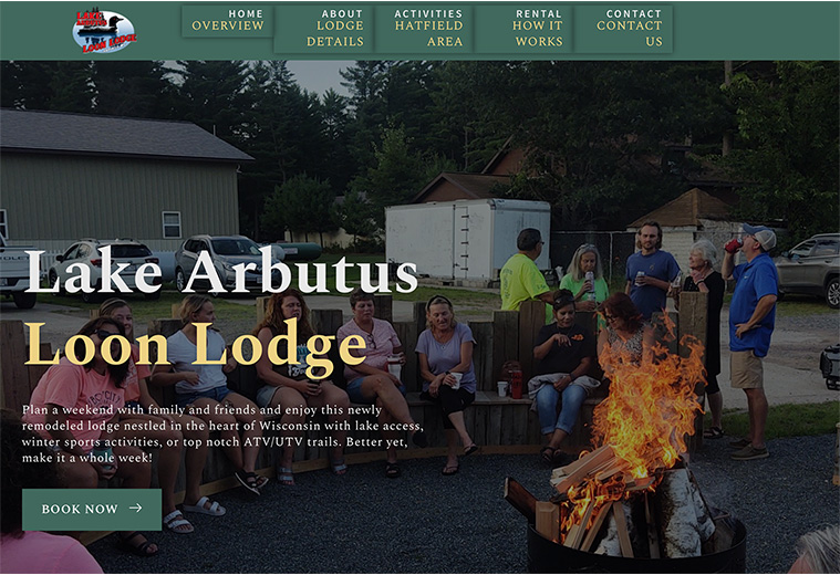
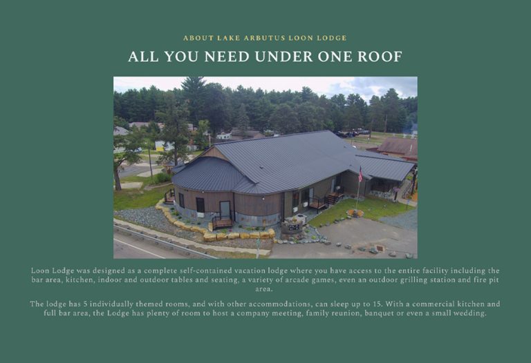
Lake Arbutus Loon Lodge - Web Design
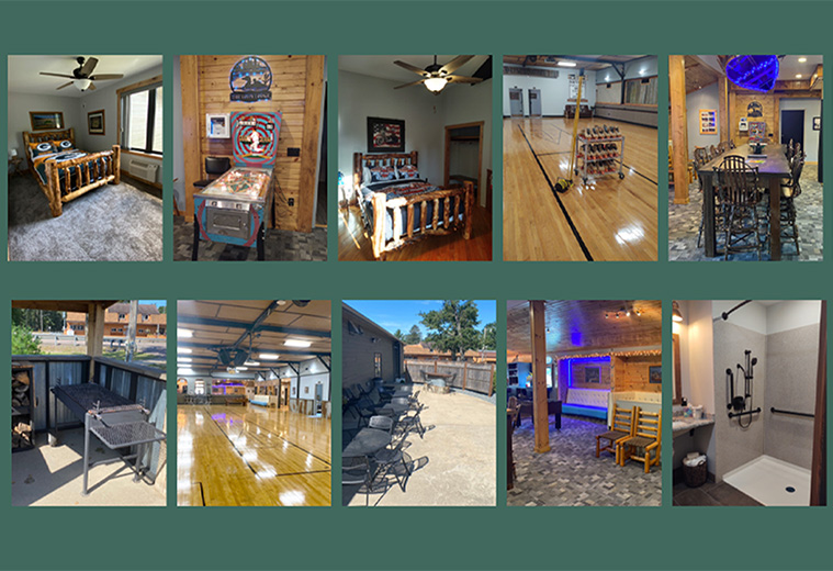
Located in the Wisconsin resort community of Hatfield, this former roller rink was skillfully crafted into an all-encompassing private resort lodge where you rent the entire facility with full access to a kitchen, bar facility, arcade games, outdoor fire pit and grilling areas, and yes, you still can use the roller rink floor! The concept deserved a highly crafted and upscale website to match. Loaded with lots of photos of the lodge, and the surrounding area, this site uses some nice, subtle effects to engage the viewer while delivering the essential information about the facility and area.

Esser Beer Company - Packaging Graphics Redesign
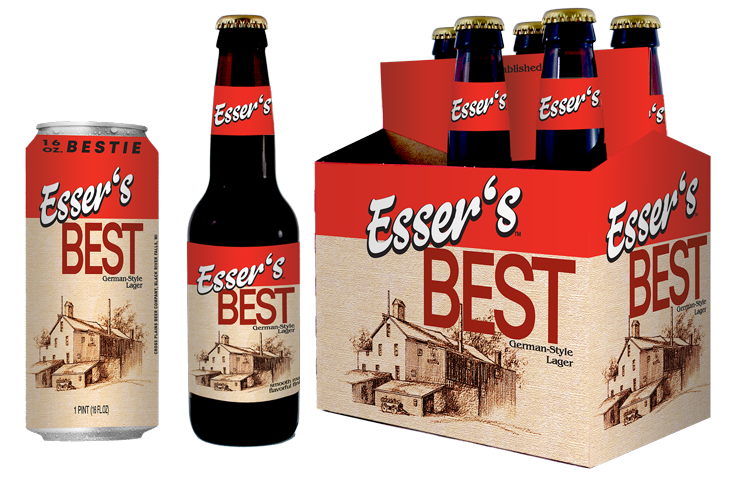
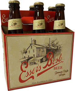
One of main reasons for undertaking a graphics redesign is to enhance shelf presence to catch a wondering consumer’s eye. For Esser’s we did this on a couple of fronts including a bolder, more contemporary font for the brand name Esser’s, then reversed this out of bright bold red top border. We separated the flavor name Best from the brand, but we kept the original brewery illustration with a slightly different texturing effect and a very subtle color shift overall. Taking a little liberty with the flavor name, we called the new 16 oz. can package the “Bestie”, because who doesn’t want to have a beer with their Bestie?
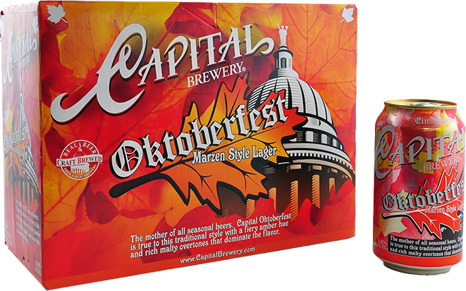
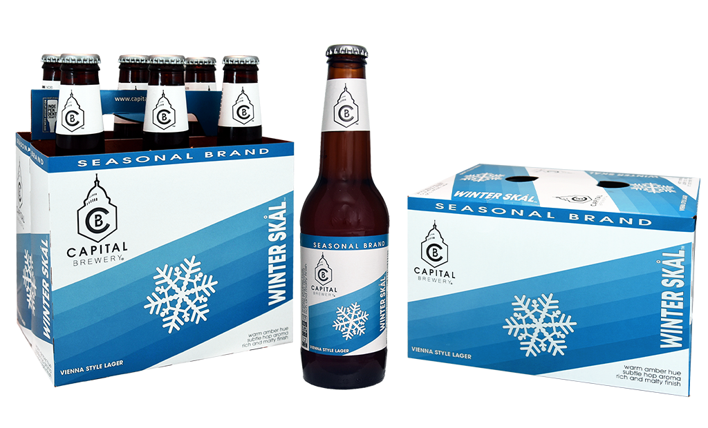
Capital Brewing Company - Packaging Graphics Redesign
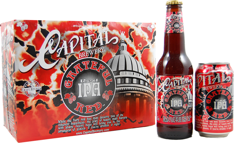
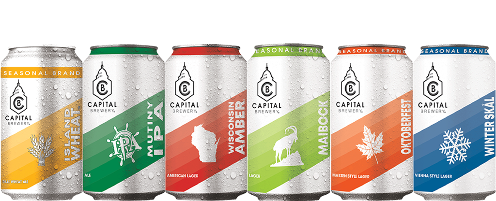
In the highly competitive craft beer market, its easy to get lost on the shelf in the battery of funky esoteric designs and flavor offerings by the dozens and dozens of competitors in the market place. The goal here was to simplify cut through the clutter. With lots of white and the strong diagonal element driven with color, this packaging scheme literally screams off the shelf.

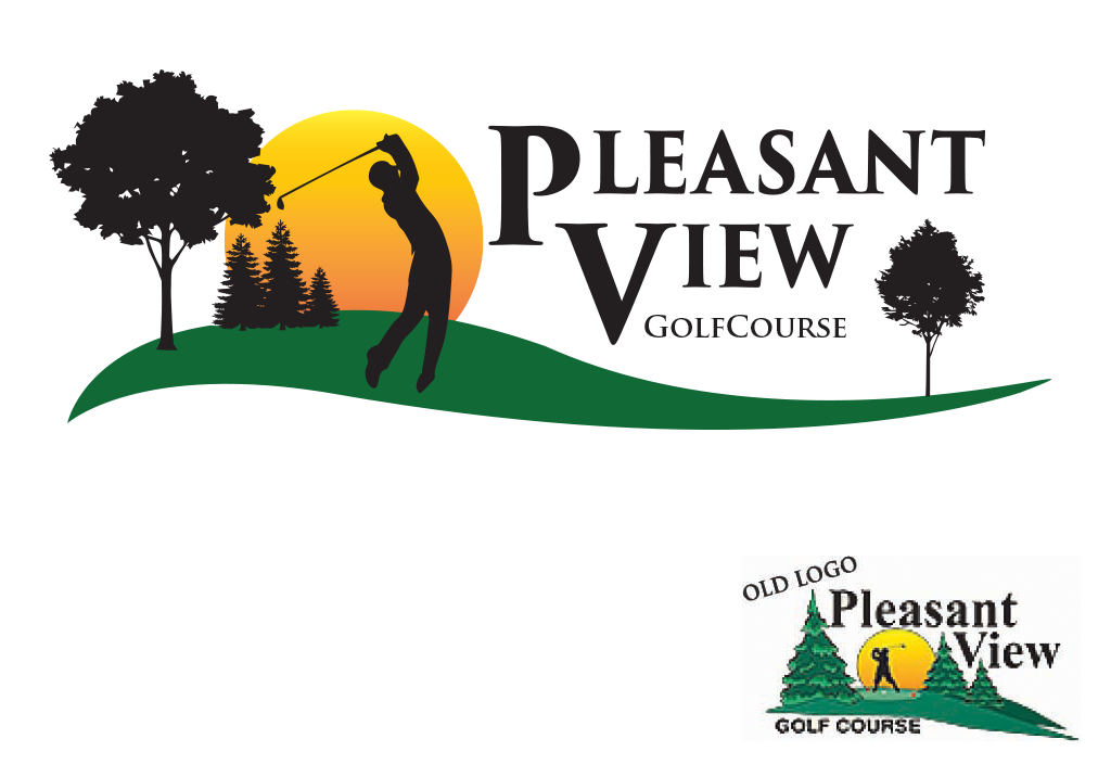
Pleasant View Golf Course - Logo Enhancement
A few years ago, Pleasant View Golf Course in Middleton, WI asked us to take a look at their old logo. They felt the design was a bit dated and with the course improvements and loss of many pines and the growth of more broadleaf trees, they wanted to evolve the logo without walking away from the familiarity of the look with locals.
We chose a similar, but updated, font and moved the name together as one element. We changed the trees to silhouettes and added a new green motion wave to depict the typography of the course, and finished it off with more comfortable ‘finish swing’ look for the player.
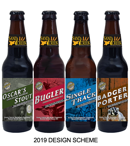
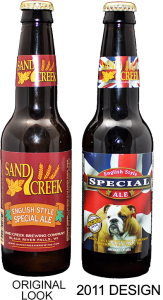
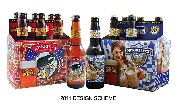
Sand Creek Brewing Co. - Packaging Graphics Redesign
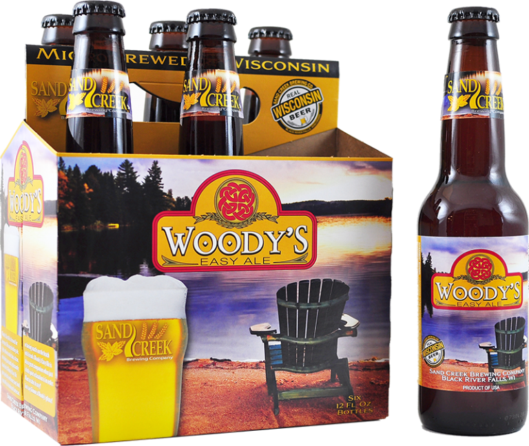
Our relationship with Sand Creek Brewing Company goes back nearly 10 years. Our first project was designing their English Style Special Ale. We introduced a whole new package scheme to them with the English Bulldog and Union Jack flag background. From there the scheme, and our relationship, took off. Each brand had its own identity, held together with the continuity of the beer glass always in the same position. This also served to inform consumers what type of beer a pale ale is (some people are afraid of dark beers…yes, its true!!) As a smart brewer, Sand Creek has recognized that packaging graphic enhancements ‘refresh’ a brand in the eye of the consumer. Hence, we’ve introduced the newest package scheme. Using many of the same elements, we added a strong diagonal element carrying the flavor name for more consistency and stronger branding on shelf.
Middleton Area Development Corporation (MADC). - Website Design
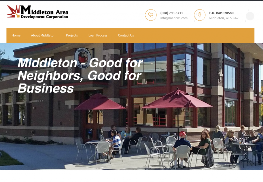
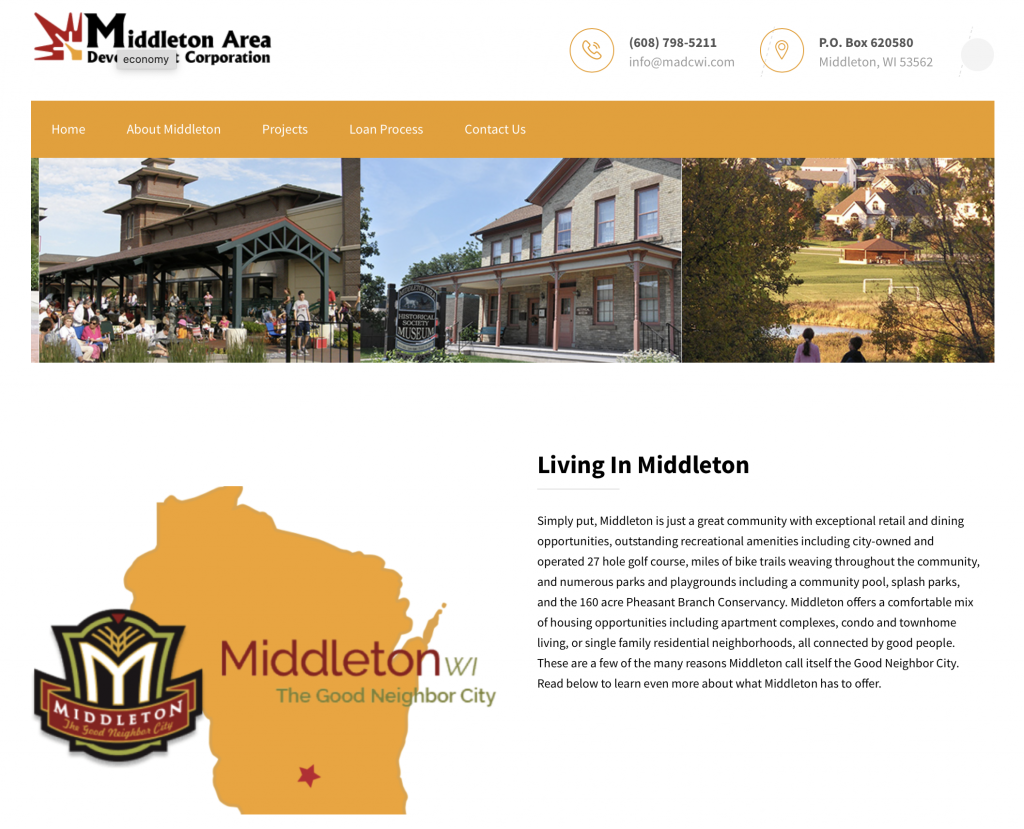
MADC is a nonprofit private loan fund working closely with the City of Middleton and Middleton Chamber of Commerce, offering alternative funding sources for economic development in and around the Middleton area. We were asked to freshen their existing website which had been sorely neglected for a few years.
Our goal was to engage, inform, and educate viewers both about what Middleton has to offer, with links to the City, Chamber, and Tourism websites to learn more about Middleton, but also how to begin the process to source funding for a project.

Banners, Signage, Booth Design.....
Over the years we’ve done the design and sourcing for several different types of materials for trades show or other brand support. Everything from booth layouts, to vinyl banners, retractable banners, mirrors, metal signs, handouts and giveaways, even neon signs. We have the knowledge, resources, and experience to help you present your company in most any situation.
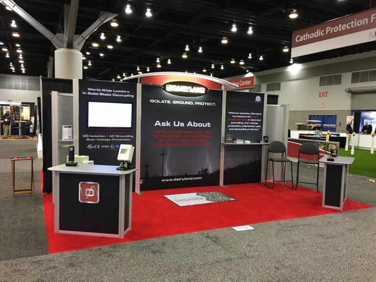
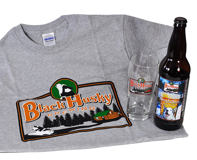
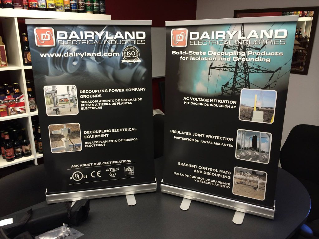
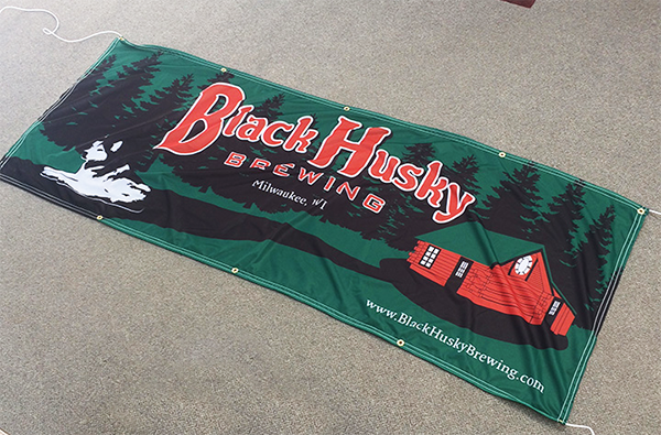
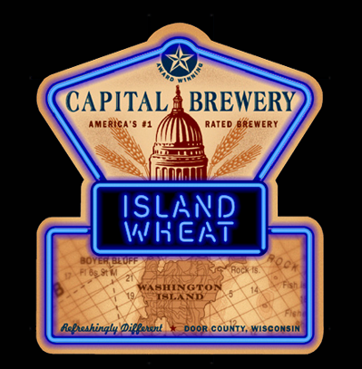
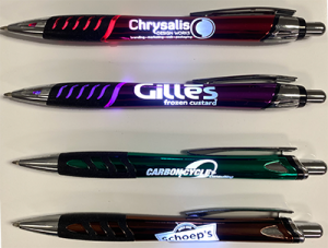
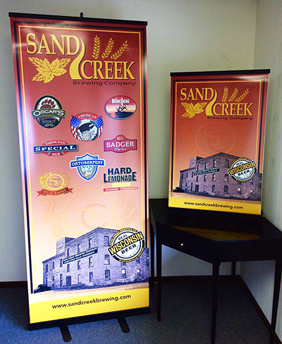
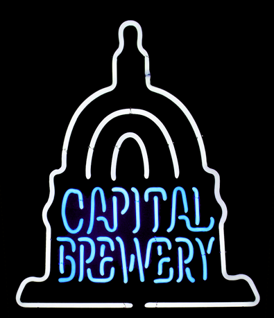
Here's a few of our favorite designs done over the years....
We won’t say that packaging is all we do, or all we love to do. But, we will say that we have the most fun doing consumer goods packaging. There’s just something special about seeing your designs attracting customers in a store! Oh, we’ve also won multiple American Package Design Awards as well….so there is that!
